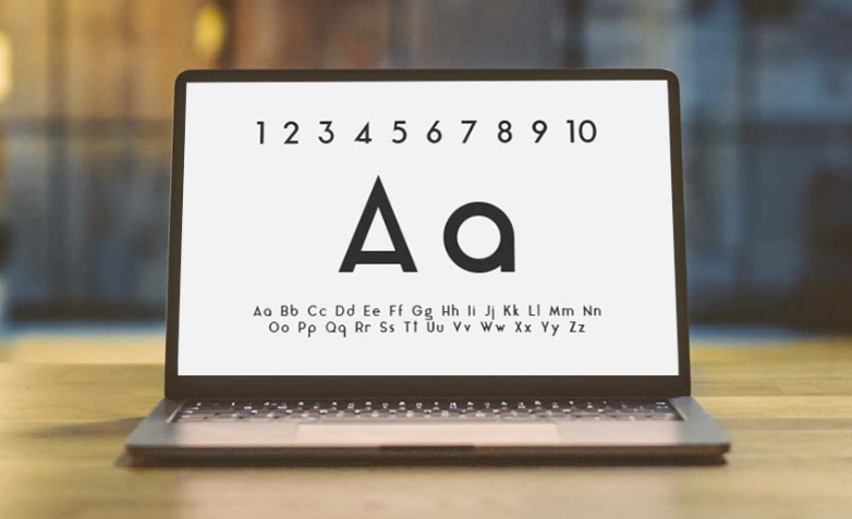
How Sans Font Creates Clean and Effective Modern Designs
A sans font is widely recognized for its clean structure, simplicity, and versatility in modern design. Without decorative strokes, it delivers clarity and precision that suit digital platforms, branding systems, and corporate communication. Today’s designers rely on professional sans font families to build structured layouts and maintain visual consistency across media. High-quality collections from TypeType Foundry provide contemporary sans font options that balance readability with strong visual identity. Understanding how to use a sans font effectively allows designers to create modern, user-friendly, and professional design solutions.
Why Sans Font Is Ideal for Digital Interfaces
One of the strongest advantages of a sans font is its excellent readability on screens. Digital platforms require typography that performs consistently across devices and resolutions. TT Norms Pro, for example, offers geometric clarity and balanced proportions that make it highly effective for user interfaces, websites, and mobile applications.
Similarly, TT Neoris provides a modern structure designed for comfortable long-form reading. Its clean lines ensure clarity in body text, navigation menus, and product descriptions. Sans fonts eliminate visual clutter, making them ideal for responsive layouts where content must adapt to different screen sizes.
For technology-focused and startup brands, TT Firs Neue delivers a contemporary tone that reinforces innovation and professionalism. Its structured appearance ensures that text remains sharp and organized in digital environments.
See also: How Home Remodeling Enhances Energy Efficiency and Indoor Comfort
Building Strong Brand Identity with Sans Font
A sans font plays a critical role in defining brand personality. Because of its simplicity, it communicates transparency, efficiency, and modern thinking. TT Travels Next offers a friendly yet structured feel, making it suitable for travel, hospitality, and lifestyle brands seeking approachability.
For brands aiming to create a bold and confident image, TT Supermolot Neue provides strong geometric forms that stand out in headlines and promotional campaigns. The consistent weight variations within a sans font family allow designers to maintain harmony across logos, websites, and marketing materials.
Using one comprehensive sans font family improves brand consistency. It ensures that all visual communication—from social media graphics to corporate presentations—feels unified and recognizable.
Creating Visual Hierarchy with Sans Font Families
Effective design requires clear visual hierarchy, and a sans font family often includes multiple weights and styles to support structured layouts. TT Norms Pro, for instance, offers a range of weights that help designers differentiate headings, subheadings, and body text without introducing unrelated typefaces.
For impactful banners and attention-grabbing sections, TT Bluescreens can be used as a bold headline element. When paired with a neutral body font like TT Neoris, the result is balanced and readable.
Creative projects may benefit from expressive sans options such as TT Globs or TT Octosquares, which introduce distinctive forms while maintaining the simplicity associated with sans fonts. The key is to maintain clarity while adding visual interest.
Applying Sans Font Across Various Design Projects
A sans font is adaptable across industries and design formats. Corporate websites and presentations benefit from structured and neutral fonts like TT Fors, which communicate professionalism and trust. For creative industries, TT Modernoir adds a distinctive character while preserving modern aesthetics.
In advertising and promotional materials, strong sans fonts enhance readability from a distance. Designers should test typography across digital mockups, print samples, and social media visuals to ensure consistency.
Because sans fonts are optimized for modern communication, they support both functional usability and visual appeal. Their clean appearance makes them especially effective for brands adopting digital-first strategies.
Conclusion
A sans font is an essential component of clean and effective modern design. Its clarity improves readability, strengthens brand identity, and supports responsive layouts. By using professional sans font families such as TT Norms Pro, TT Neoris, TT Firs Neue, TT Supermolot Neue, TT Travels Next, and others from TypeType Foundry, designers can create cohesive and impactful visual systems. Thoughtful application of a sans font ensures that design remains modern, accessible, and aligned with professional standards across all platforms.


