Custom Wine Bottle Labels: A Sydney Winery’s Guide to Getting It Right
Your wine might be perfect. The blend could be spot-on, the ageing process flawless. But here’s the thing: if your label doesn’t grab attention on the shelf where the bottles are placed, none of that matters.
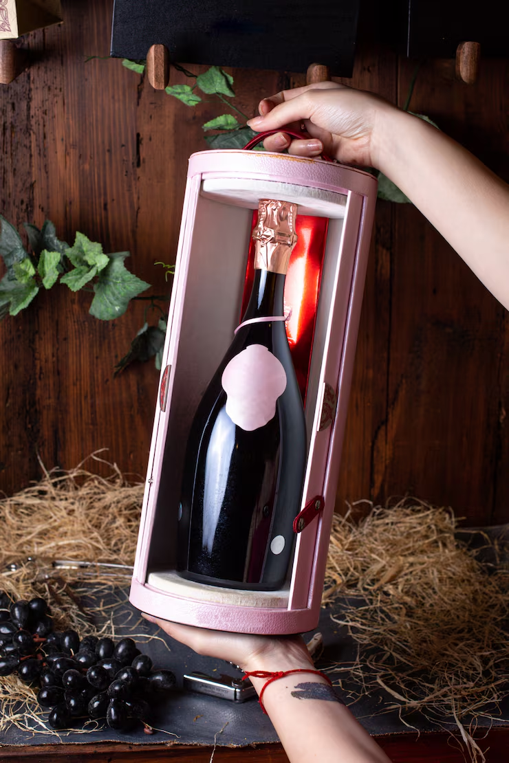
Labels are the first conversation your wine has with a customer. They speak before anyone tastes a drop. For Sydney wineries, getting custom wine bottle labels right isn’t just about looking good. It’s about standing out in a crowded market where every bottle is fighting for the same attention.
Let’s break down what actually works.
Why your label choice matters more than you think
Walk into any bottleshop. You’ll see hundreds of wines lined up, all competing for a glance. Most people make their choice in seconds. They’re not reading tasting notes or checking awards. They’re looking at labels.
A weak label means your wine gets ignored. A strong one? It gets picked up, examined, maybe even bought. That’s the difference between moving stock and watching it sit there.
Sydney producers face extra pressure. Local competition is fierce. Imported wines flood the market. Your label needs to work harder than ever.
See also: How to Choose a Financial Advisor in Brisbane: 7 Questions You Must Ask
What makes a wine label actually sell
Quality printing is the foundation. Cheap labels fade, peel, or smudge. They make your wine look like an afterthought. Customers notice. They assume that if you cut corners on the label, you probably cut corners on what’s inside the bottle.
Custom wine bottle labels need to survive real-world conditions. Cold storage, condensation, and handling during transport. If your label can’t handle a trip from the warehouse to the customer’s fridge, you’ve already lost.
Material choice plays a bigger role than most people realise. Paper labels work for some wines. Others need something tougher. Polypropylene handles moisture without breaking down. It stays crisp even when the bottle’s been sitting in an ice bucket for an hour.
Finish matters too. Gloss catches light and draws the eye. Matte feels more premium, more refined. The wrong finish can make a great design fall flat.
Designing labels that connect with buyers
Design trends come and go. What doesn’t change is the need for clarity. Your label should tell people what they’re looking at within two seconds. Varietal, region, producer. Make it easy.
Some wineries try to cram too much onto the label. Long stories, detailed descriptions, tiny text. It backfires. People don’t have time to read an essay in the wine aisle. They want the key facts and a reason to care.
Colour choices signal different things. Deep reds and blacks suggest bold, full-bodied wines. Lighter tones hint at something more delicate. Your colour scheme should match what’s in the bottle. Misleading customers once means they won’t come back.
Typography is another area where mistakes happen. Fancy fonts might look artistic, but if they’re hard to read, they’re useless. Legibility always wins over clever design.
Local production gives you an edge.
Ordering labels from overseas might seem cheaper at first. Then you factor in shipping delays, minimum order quantities that force you to overstock, and the headache of dealing with problems from halfway around the world.
Sydney-based production keeps things simple. Faster turnaround means you can respond to demand without sitting on excess inventory. Need a small batch for a limited release? Local suppliers make that possible.
There’s also something to be said for supporting local manufacturing. Customers notice when you’re keeping production close to home. It adds another layer of authenticity to your brand.
Self-service ordering saves time and money.
Complicated ordering processes waste time. You shouldn’t need to schedule calls or wait days for quotes. Online ordering tools let you upload your design, choose your specs, and place your order in minutes.
Templates help if you’re not working with a professional designer. Many wineries handle their own labels now. The tools are straightforward enough that you don’t need a design degree to get good results.
Turnaround times matter when you’re planning a release. Knowing exactly when your labels will arrive lets you coordinate bottling and distribution without guesswork.
Avoiding common label mistakes
One mistake is underestimating how much moisture affects labels. If you’re selling whites or rosés that spend time chilled, you need labels that can handle it. Paper might work for reds that stay at room temperature. It won’t cut it for wines that live in fridges or ice buckets.
Another issue is ordering too many labels at once. It seems economical until you realise you’re stuck with thousands of labels for a vintage you’ve already sold through. Smaller runs give you flexibility without locking up cash in inventory.
Some producers also overlook compliance requirements. Wine labelling regulations in Australia are specific. Missing information or incorrect formatting can cause problems. Better to get it right from the start than reprint later.
Testing before you commit
Before ordering your full run, get samples. See how the material feels. Check how the colours print. Look at it under different lighting. What looks great on a screen might not translate to the actual label.
Show the sample to people outside your business. Fresh eyes catch things you’ve been staring at too long to notice. If something feels off, fix it before printing thousands.
Matching labels to your wine style
Your label should reflect what’s inside. A premium single-vineyard release deserves a label that signals quality. A casual, everyday wine can be more relaxed and approachable.
Think about where your wine will be sold. Restaurant wine lists? Boutique retailers? Dan Murphy’s? Each environment has different visual competition. Your label needs to work in its intended context.
Durability under pressure
Temperature-resistant labels matter more than most people think. Condensation happens. Bottles get handled with wet hands. Labels that curl or peel look cheap and unprofessional.
Transport is another test. Boxes get stacked, shifted, dropped. Labels need to stay put through all of it. The last thing you want is your branding falling off before the wine reaches the customer.
The practical side of label production
Minimum order quantities can trap you if you’re not careful. Some suppliers force you to order thousands of labels at once. That’s fine for large producers. For smaller wineries, it ties up money and storage space.
Scalable production options let you start small and increase as demand grows. You’re not betting big on an untested design or a new release.
File formats matter when uploading designs. Vector files print cleaner than rasters. Colour profiles need to be set correctly, or what you see on screen won’t match what prints. Getting these details right saves headaches later.
Final thoughts
Your label is doing more work than you might realise. It’s your salesperson, your brand ambassador, and your first impression all rolled into one. Getting it right means choosing quality materials, clear design, and a production partner who understands what Sydney wineries need.
The wineries that succeed aren’t always the ones with the biggest budgets. They’re the ones who understand that every detail matters. Labels included.


